

Some of the Best and Worst Brand Logo Changes
My Opinion on Some Rebrands

Once in a while, perhaps every 12 to 20 years, the best interest of a company is to change up the image of their brand, whether that is to simply update the design to something that looks more modern, or to visually reflect a change in what they offer to consumers. This is the main example of rebranding. Many companies’ graphic designers do well in updating the brand logo/image to something more clever, attention-grabbing, easier on the eyes, etc. But on the flip side, there are plenty (possibly more) examples of downgrading in design, turning the brand logo into something ugly, basic, or uninteresting. I understand that design and beauty altogether are subjective, and it is really a matter of opinion as to what looks appealing and what looks ugly. There have been instances where the majority of consumers agreed that a certain rebrand was a better look, and instances where they thought quite the opposite. Some rebrand designs take time for people to appreciate despite backlash at the beginning.
This post is formatted a bit differently in that it is a list of rebrands that I think are good-quality and ones that I think are serious downgrades. I’m considering writing a follow-up post about the subject of modern design, which will discuss a bit more than just brand logos. But anyway, here is my list of some of the best and worst brand logo changes. I limited both categories to four examples.
BEST
KIA
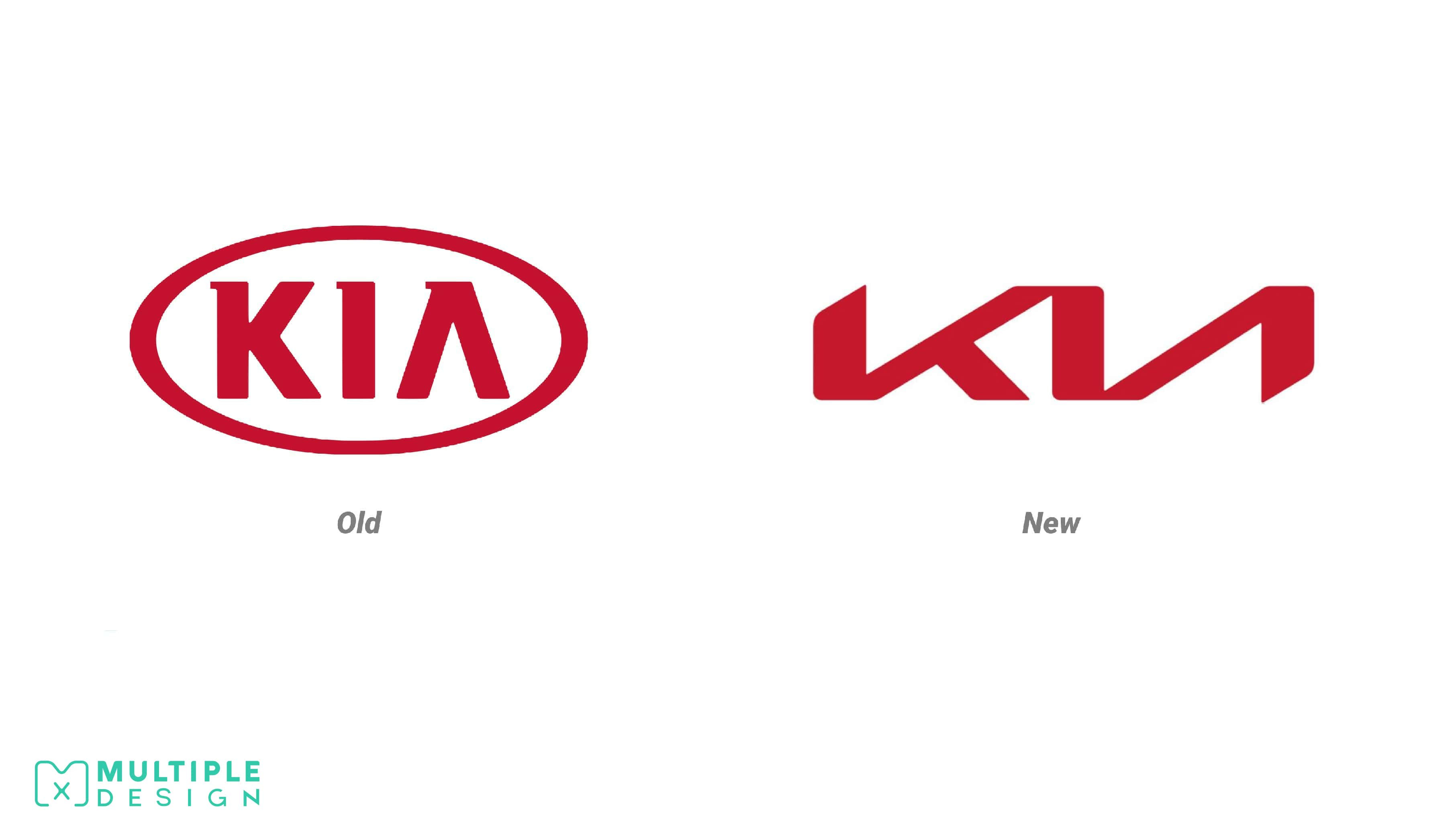
I’m not just saying this as a KIA owner myself when I say this is a great design change. This one is a true example of what I would call an upgrade. The old logo wasn’t bad, but it definitely lacked pizzazz and was due for a touch-up. I think the new logo is sleek, modern, and attention-grabbing. This new logo is representative of KIA making important changes as a company, moving up in the car business and building a better reputation as a middle-class chic car brand.
Nissan
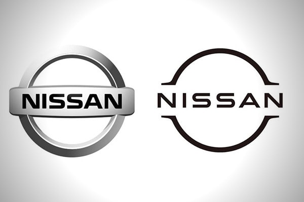
Much like its competitor, Nissan’s logo was long due for a change, and wow did they go about it the right way! Nissan stuck with the circle-and-bar design, but with a minimalist, modern touch. Though I’m not quite fond of the minimalist look that many brands are moving toward, I think this is one a good example of doing enough while staying original. The new logo does not veer too far from their notable look, and the font is not dramatically different from the previous. Nissan’s new design is stylish and a bit futuristic too.
American Airlines (top: previous | bottom: current)
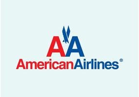
My take on this may be mildly controversial, but in my defense, I actually did not know about this relatively recent logo change until researching for this post. Possibly all my flights on American Airlines have been post-rebrand, so I hadn’t really thought much of the logo itself. Apparently, the previous logo had a several-decades long run, and many patrons probably thought fondly of it. Nonetheless, I think this change is an upgrade for sure. Yes, it’s simplistic, maybe too basic, but I would say the new logo is sleek, professional, and just as memorable as the previous. I look at the symbol next to the name and think of an eagle but also an airplane. Though the name part is one color, I like the incorporation of red, white, and blue (American colors) on the eagle-like symbol. Overall, the 11-year-old American Airlines logo is high-quality and representative of an airline company.
Comfort Inn
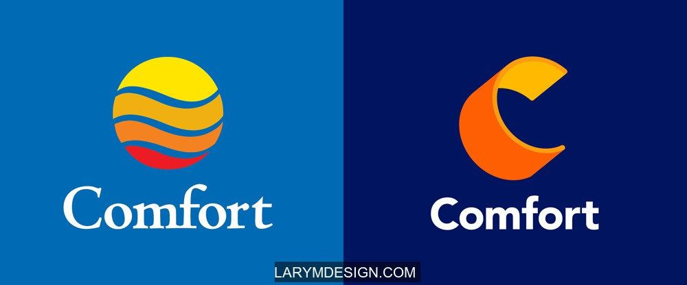
The new Comfort Inn logo is definitely memorable and eye-catching. I like this use of complementary colors, along with the illusory three-dimensional element of the big “C.” The blue background is deeper, which could be perceived as more calming or representing the night sky. I like the new font, but at the same time it is a bit unoriginal. That is my only critique. I would’ve went for a more creative font, but I suppose they went with this one since it is easy on the eyes. I think Comfort’s new logo does the job in selling the message of coziness and warm hospitality.
WORST
Pringles
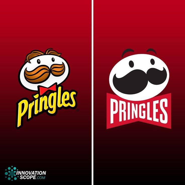
I mean, where do I start? I don’t think I’m in the minority when I say that the new Pringles logo is hot trash. It is lifeless, dull, and bare-minimum in its presentation, especially when compared to the previous. The mascot face is a shell of his former self! There’s no glimmer in the eyes, the hair is gone, the style is flat; the whole thing lacks definition. Instead of hair the mascot has these raised eyebrows to give him some sort of expression to compensate for this ambitiously awful logo. He doesn’t even have a bow-tie anymore! The font change is equally bad, taking away the whole creativity of not only a complementary yellow, but also the little chip as the dot for the “i.” Sad to say, but Pringles is a prime example of a new design disaster.
Burberry
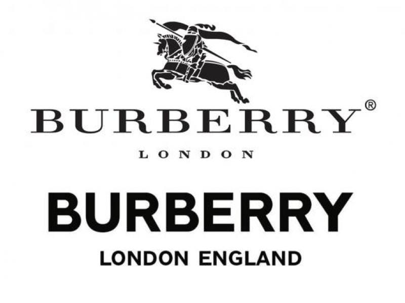
Burberry is actually one of many fashion brands that went for the basic, refined type of logo font, turning the logo into one that is so unoriginal that it nearly matches everyone else. The previous style is clearly so much better than the current. The new one lacks all the prestige and sophistication that the previous displayed so well. I seriously wonder why they would get rid of the whole knight and horse image too! At least they added the word “England” in case anyone forgot where London is located.
Taco Bell
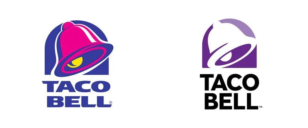
More like Taco Hell, am I right? The iconic, multicolored logo that had been going strong since the 90s needed to go, apparently. I understand that 21 years is a long time to have the same logo, and there is nothing wrong with a change, but wow, this one is horrific! I like purple, but somehow this new design has what looks like the dullest form of purple imaginable. Along with that there’s only white to fill in the bell. The font is basic trash, too big, and out of all colors they decided black. I mean…why? Taco Bell is a fast food chain and they thought it was a good idea to have white, dull purple, along with black letters? When I look at the new logo, along with the boring, neutral-colored metal box that is most fast food joints now, I’m confused as to whether they’re offering food or office supplies. The Taco Bell brand aesthetic, at least in my opinion, went from fun to disappointing.
Best Buy
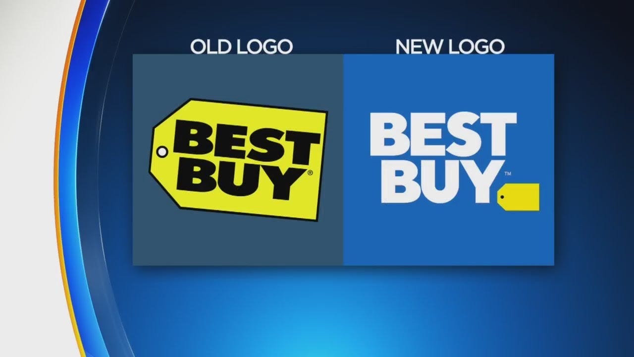
Best Buy is another example of a long-standing logo that arguably needed a change. I think their previous logo is a timeless classic and did not need as dramatic of a change as this. Again, we see basic bold font, this time white instead of black, along with a bright yellow tag that serves no other purpose than just being an attention-grabbing visual. It’s one thing that they don’t have the name on the tag anymore, but why just put a tiny tag next to the large letters, especially if there’s no string attached? It just looks awkward. And the hue of blue with this new design is nothing special either. I will say this, the Best Buy logo does well in representing the shift in the products the store offers, which is every electronic device you can think of and no physical media at all. Boring!